


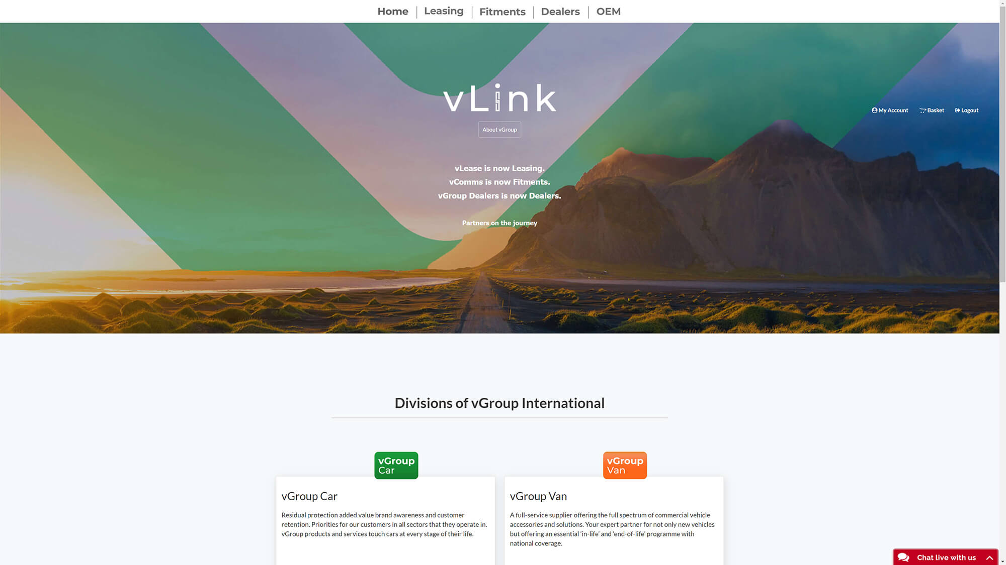
After we were provided with access to the platform, we tested it thoroughly. The user journey looks as follows


Take a look at this original user flow:

Looks quite long, doesn't it? Well, for now, we take it as it is and analyze this flow with some data. We got access to the company's Google Analytics, which was not set up except the added pixel. In there, we rebuilt the user flow to see where the actual users went.
First, the basics, which seem natural:
Now for the Flow. Remember these sections from the original user flow?

This is how the user base is distributed in these decision diamonds:
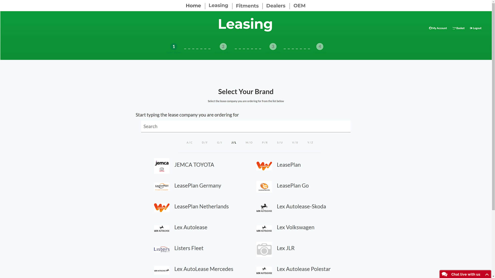
As you can see, the vast majority of the user base is using only one of those options. This makes this selection step unnecessary. We can remove it from the flow and include the options into the filter system we will implement later on. The following part of the flow shows once more how the users spread in these sections. The whole snippet can be removed. After this step, we also remove the company selector, since this info will be stored in the user profile and does not have to be selected again for every visit.

There was one more insight in the data, which is the actual average time a user needed to complete a purchase.
The top two pages are part of the main flow which every user has to go through. These already count for over 16 Minutes. For ordering a standard package, which every user of the website has probably done a dozen times already, because it is basically the same for every car he is selling. The overall average time we calculated accounted for 19 Minutes per order.
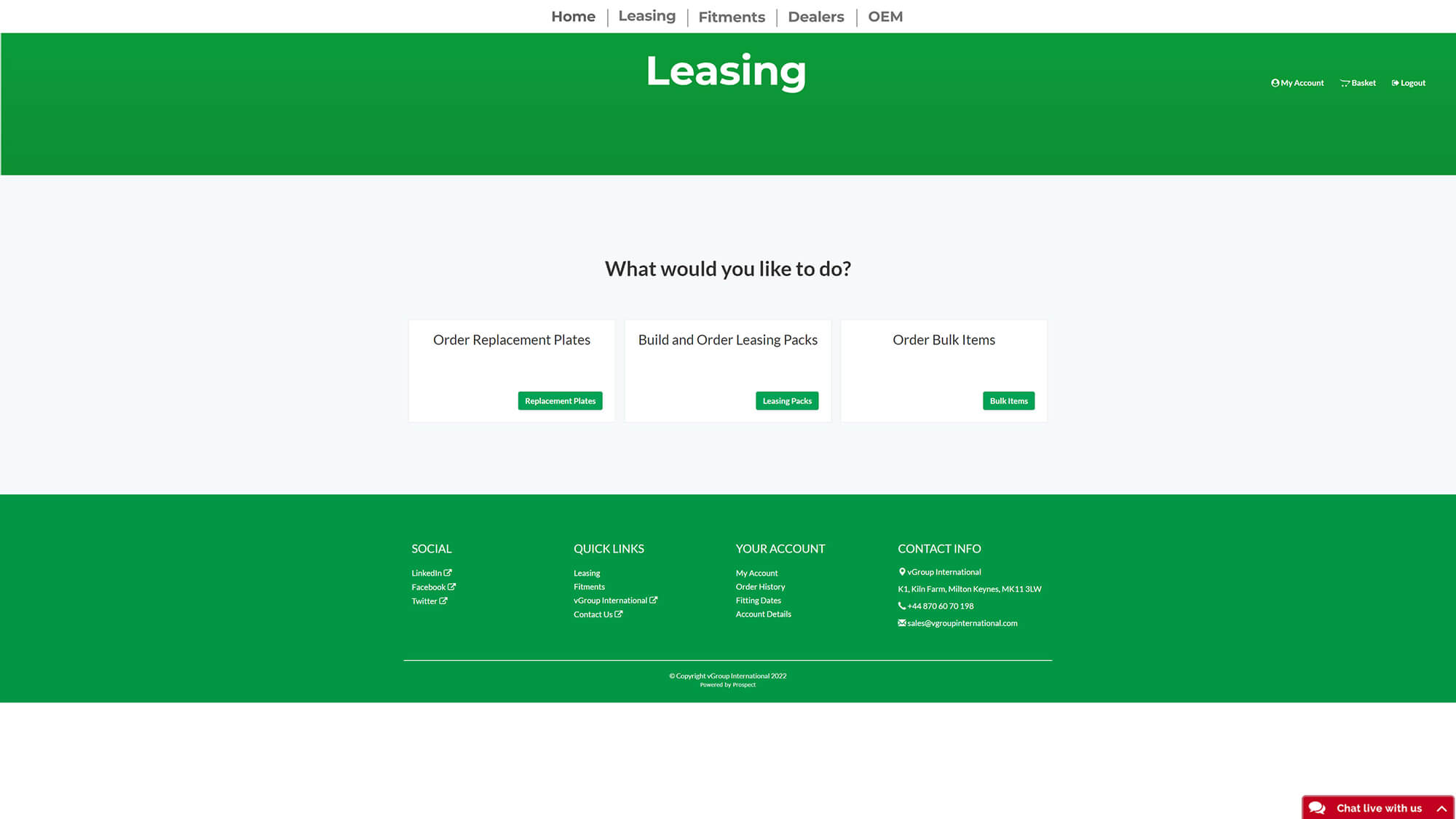
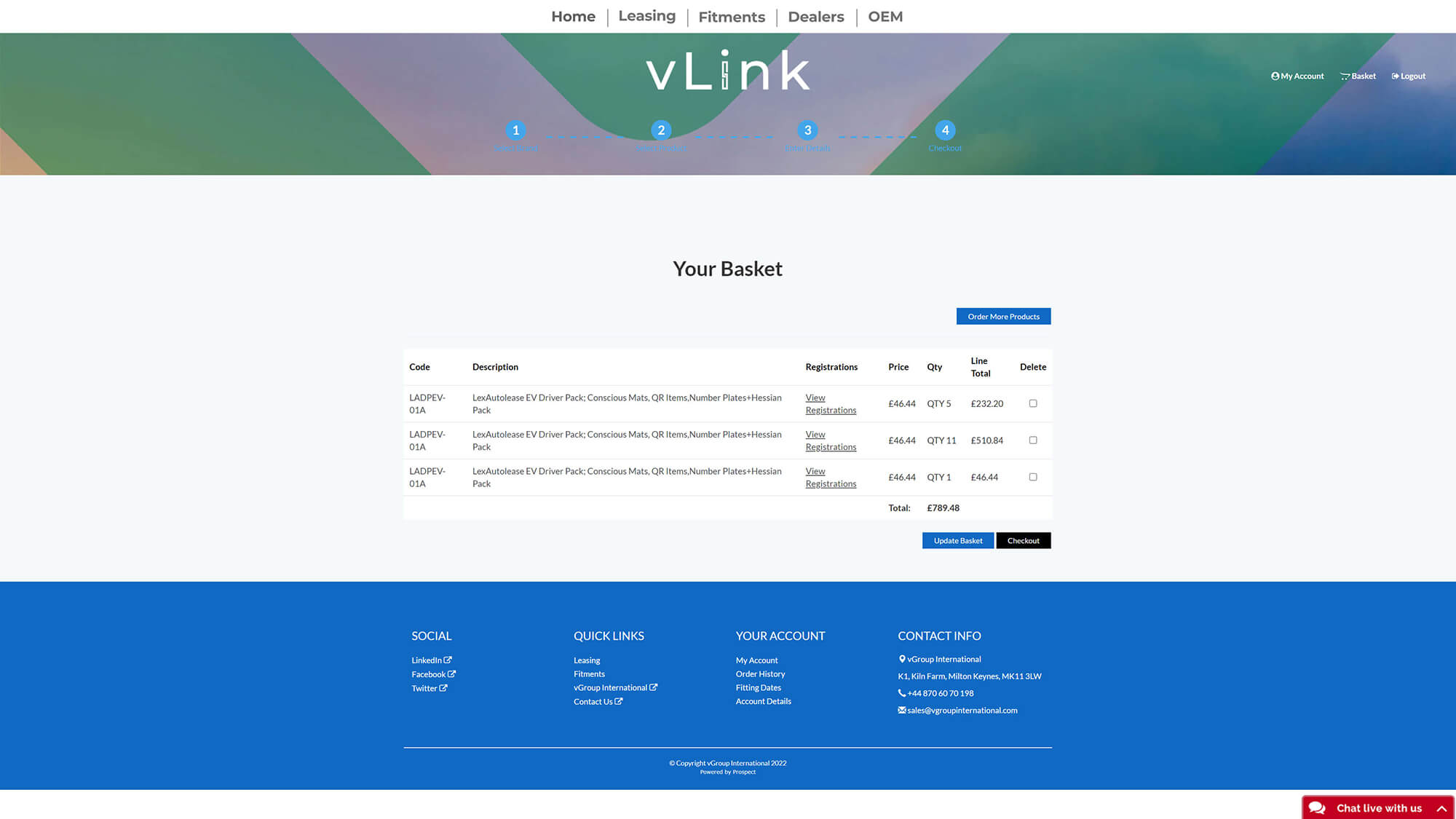
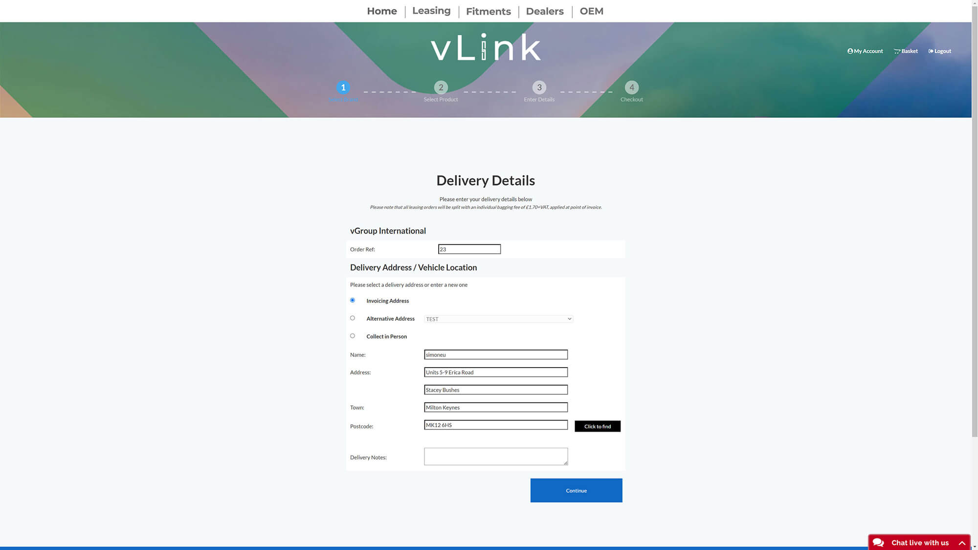
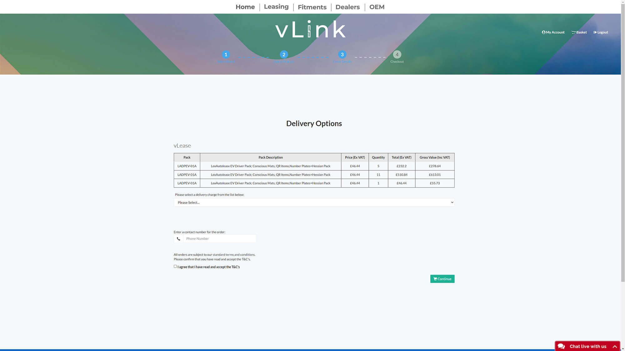
After improving the flow and looking for the main culprit, the rest of the task was basically split in two: optimize the checkout, and most important, find a solution for the product configuration. It needs a little explanation, since a lot is happening here, and parts of it are actually crazy complicated.

What you are doing here is
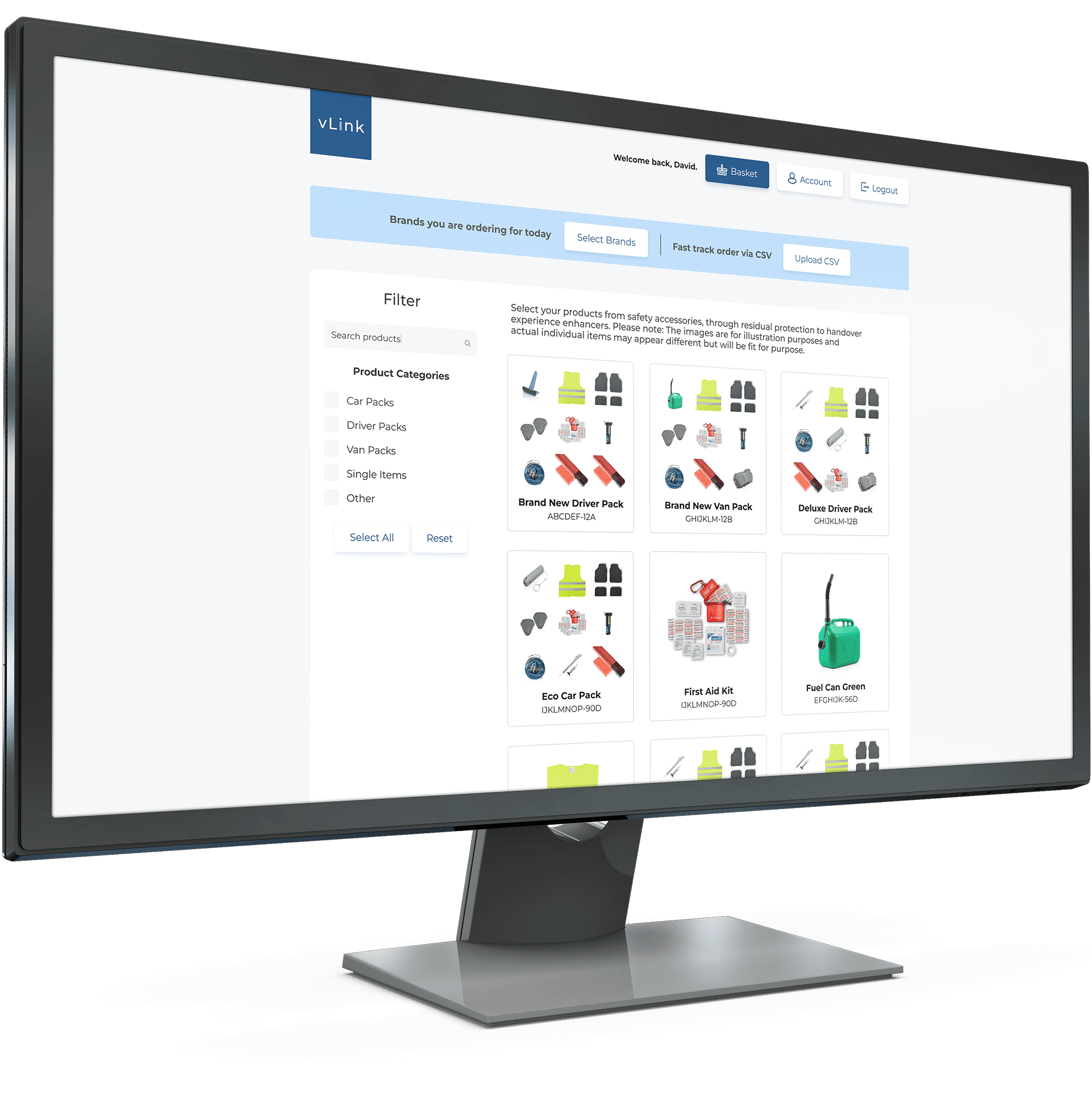
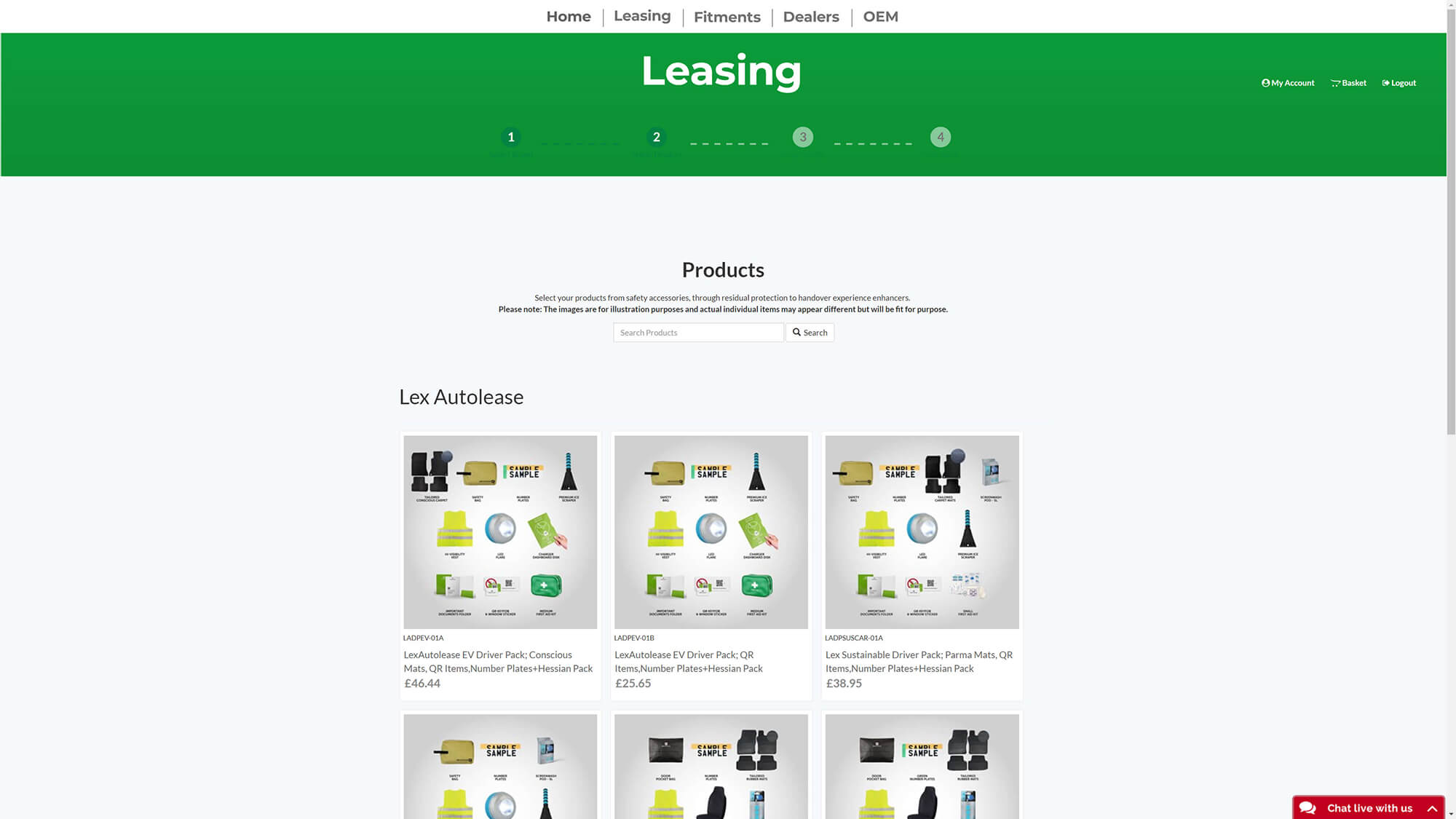
The first part of selecting your product is to browser for it in the product overview. In the ideation stage, this part was simple because there are tons of webshops all with this same concept.
On the Product Overview, we introduced this new element called the "Top Bar", where the user is able to preselect the brands he is ordering for. This way, the user can get the problem out of the way before even looking for the packs he needs. This element was changed and improved through several iterations, but the overall idea was set from the start.
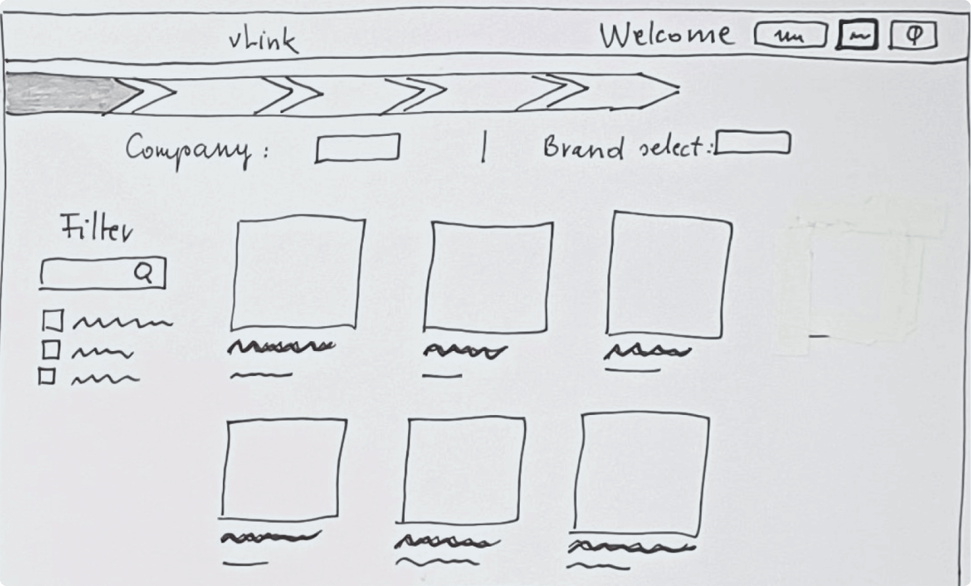
This element itself underwent some iterations (adding the search bar and scrollbar for better handling), looked like this in the high fidelity prototype.
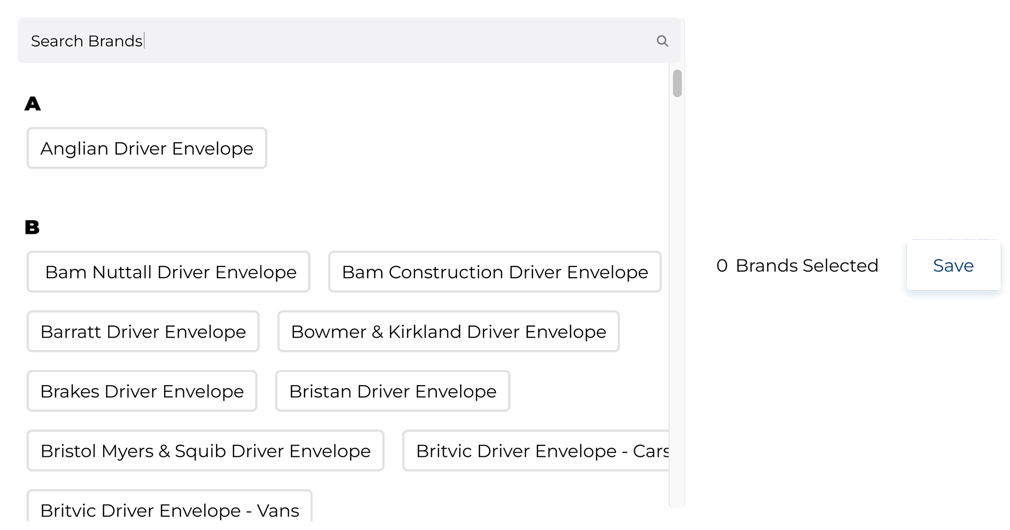
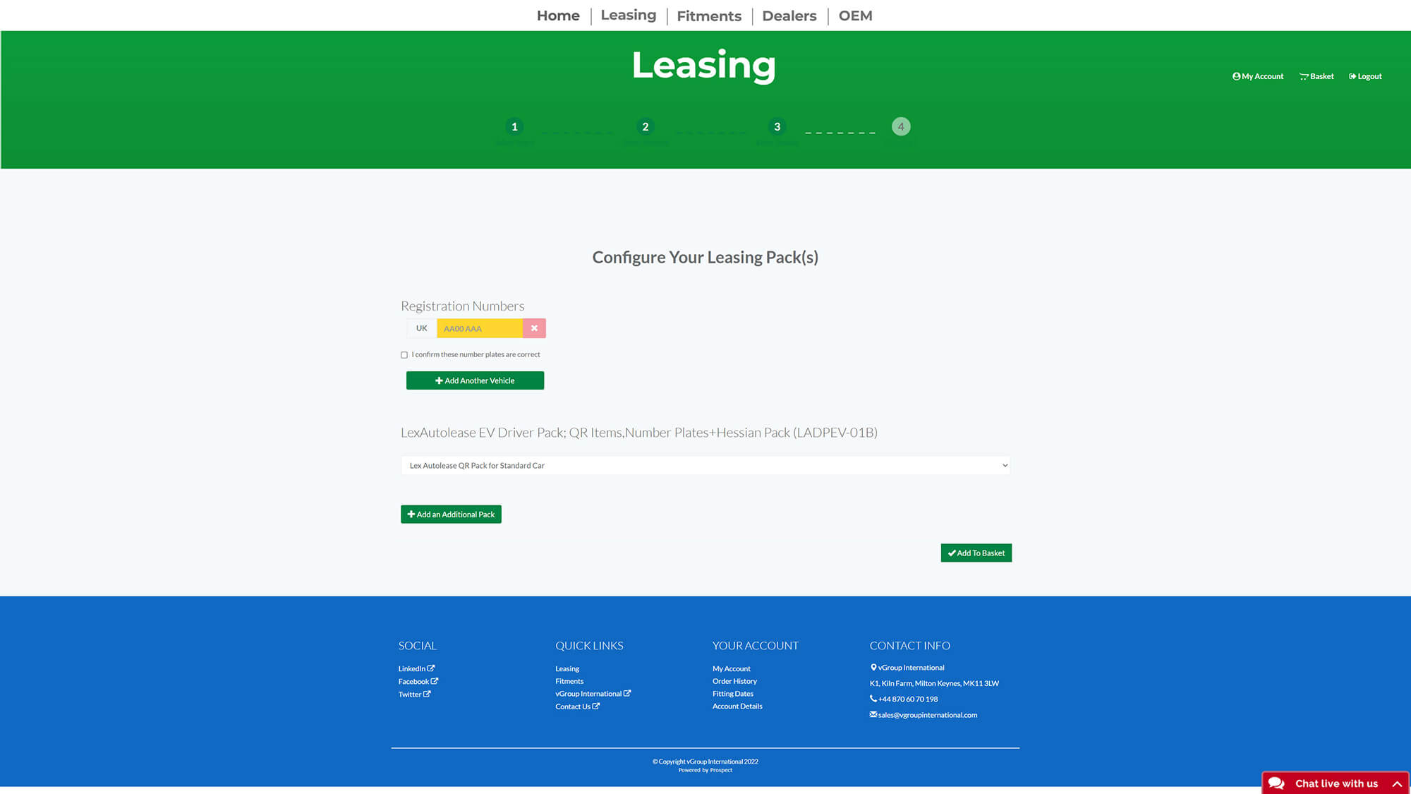
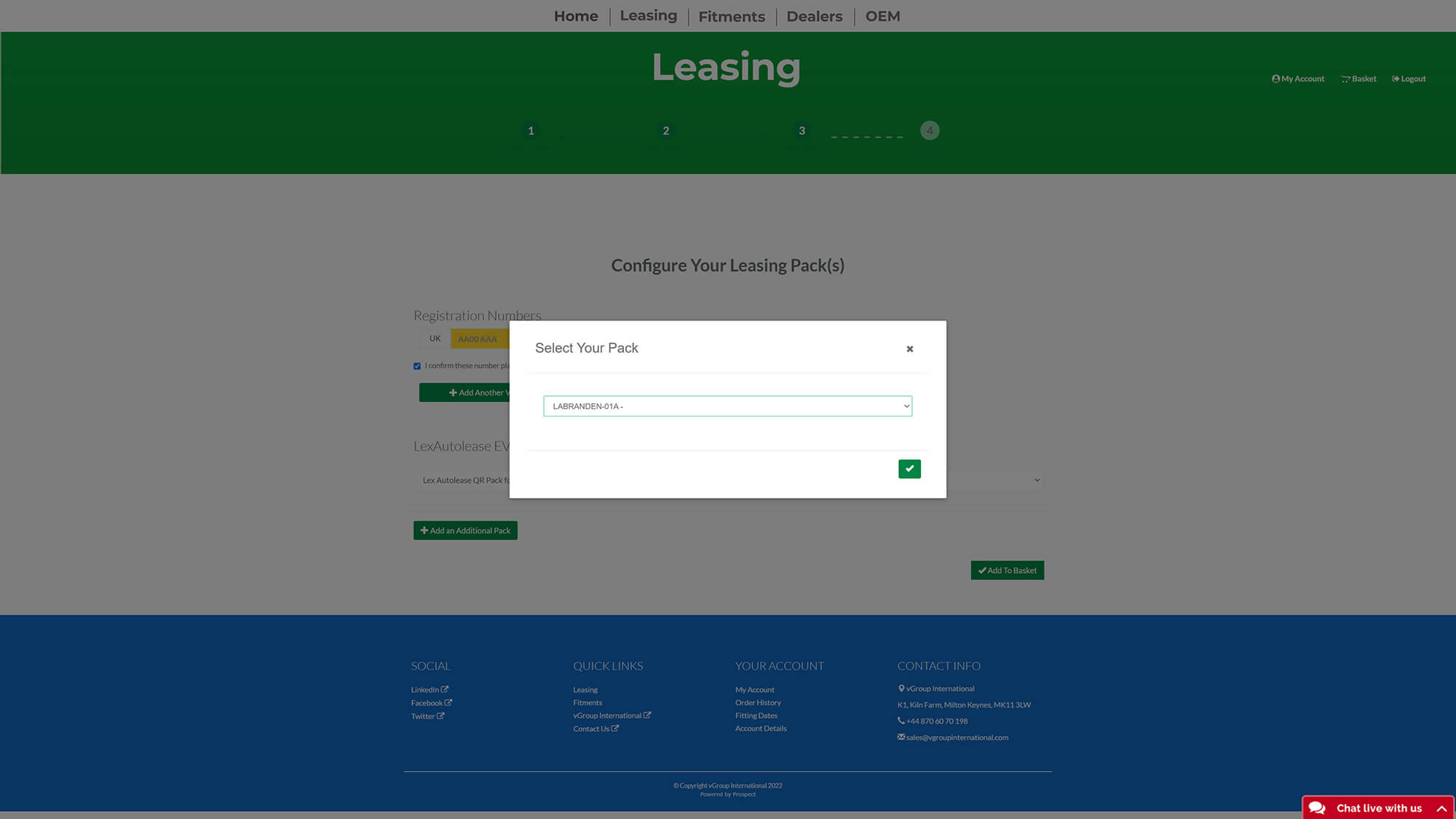
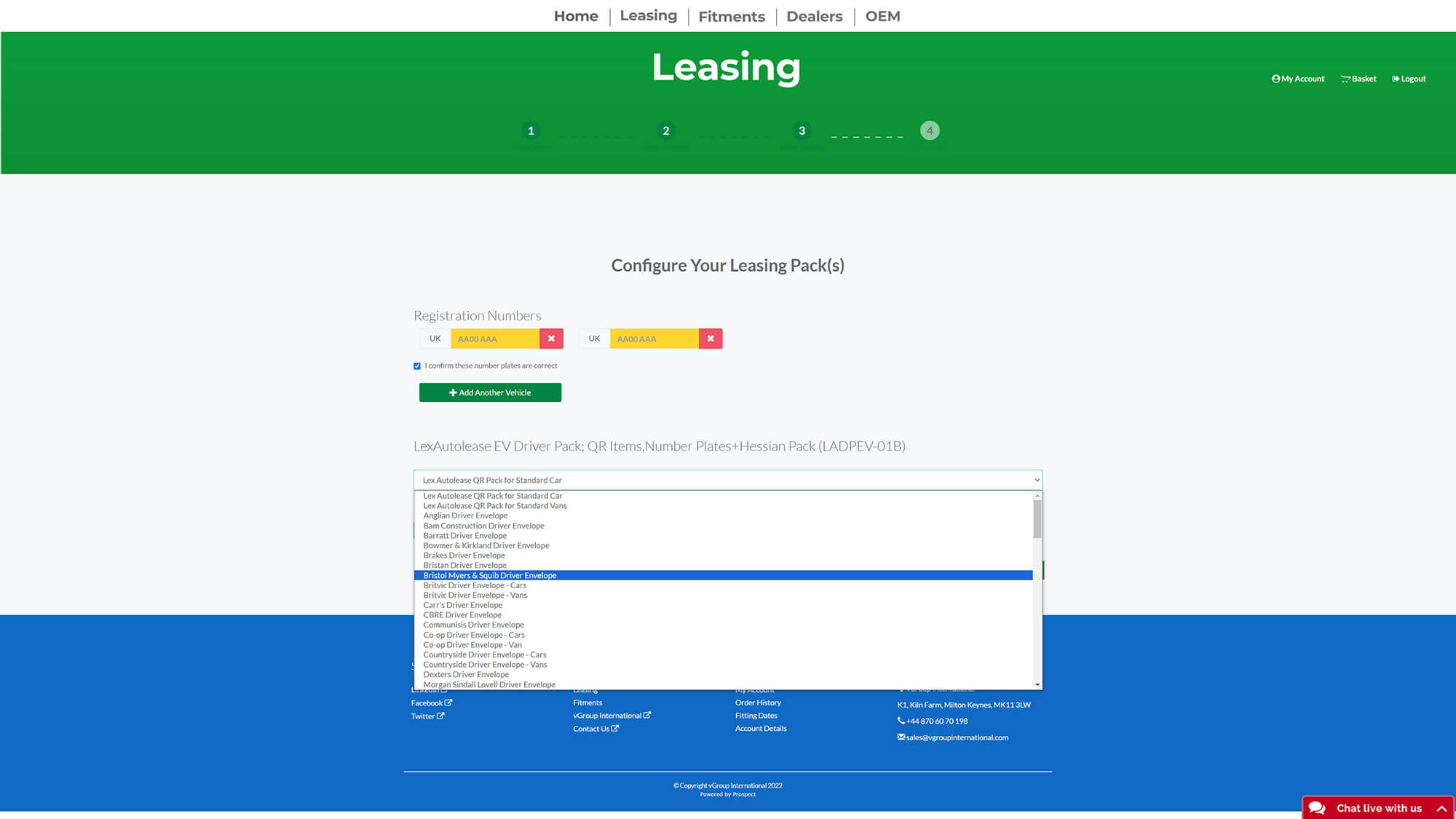
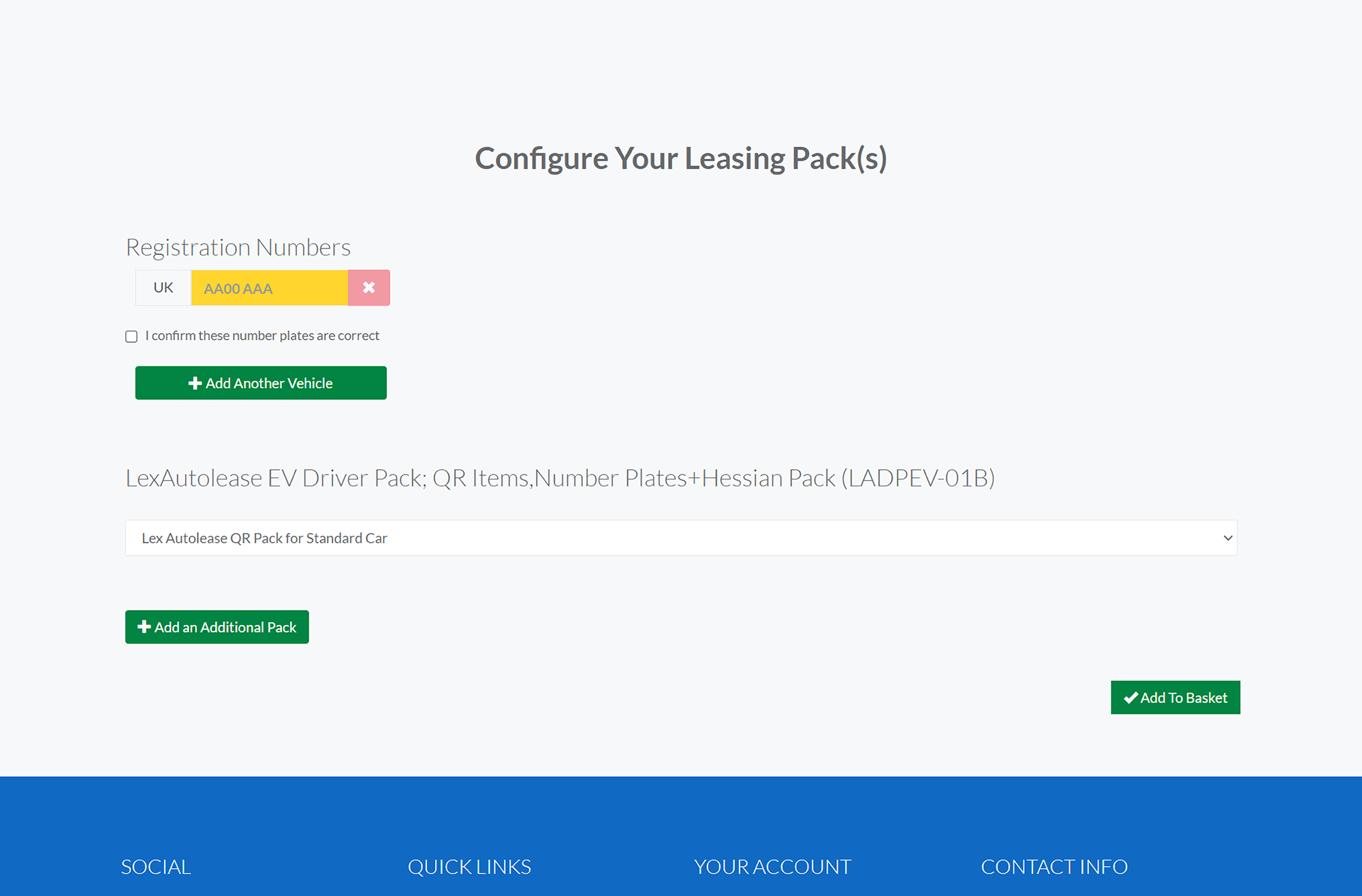
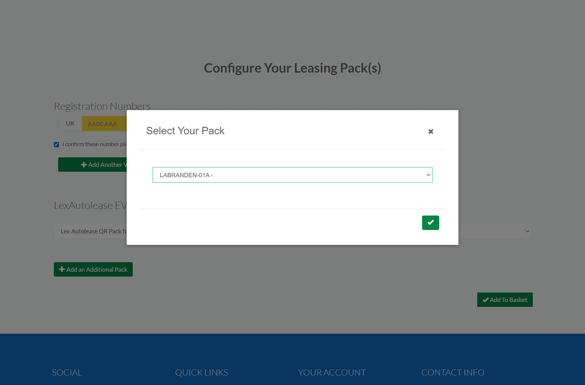
When a pack is selected, the product detail page includes what you expect: an image gallery of the elements of the pack, as well as a short description and the pack prize. What follows this is the most important part of the refined webshop: the module to assign plates to brands.
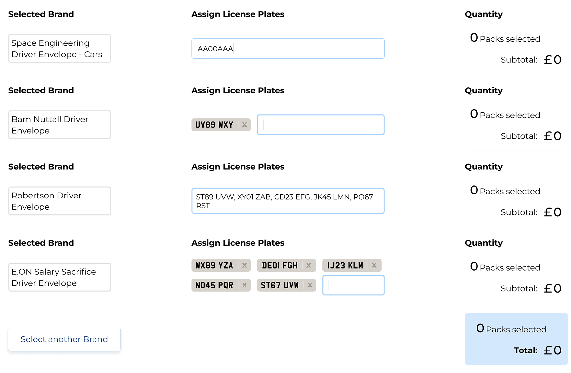
What's happening here?
Now I want to show the improved flow which includes all of these elements. Notice here the optional path by uploading a .csv file for power users - this way you can just upload a preconfigured .csv file and go directly to the checkout.

The prototypes went through two sessions of usability tests with 5 testers each, all experienced users of the original platform, one concept test round and one for the high fidelity prototype. The learnings from these were very helpful for a lot of details to be changed, mainly focussed on UX writing and System Messages/System Feedback, and on the other hand proving our solutions very useful.


